
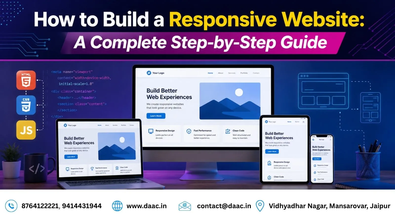
A responsive website is one that automatically adjusts its layout, images, and content according to different screen sizes such as mobile, tablet, and desktop. In today’s digital world, users access websites from multiple devices, which makes responsive design an essential requirement for every business and developer.
Web designing is the process of planning, creating, and maintaining websites that offer a smooth user experience. It includes layout design, color combination, typography, and interactive elements. Modern web designers also focus on coding skills like HTML, CSS, and JavaScript along with tools such as Figma and Adobe XD.
A well-designed responsive website not only improves user experience but also increases engagement, conversions, and search engine rankings.
Why Responsive Web Design Matters in 2026
Responsive design has become a standard practice due to the rapid growth of mobile internet usage and digital platforms.
Some key reasons include:
- Mobile users dominate web traffic globally
- Google prioritizes mobile-friendly websites
- Better user experience across all devices
- Higher conversion rates for businesses
- Improved SEO performance and ranking
For example, e-commerce platforms like Amazon and Flipkart use fully responsive designs to ensure smooth shopping experiences on all devices.
Key Principles of Web Design You Must Know
Before building a responsive website, it is important to understand core design principles.
Layout and Structure
A clean and structured layout helps users navigate websites easily. Designers use grids and spacing techniques to organize content.
Typography and Readability
Fonts should be clear, readable, and consistent across all devices. Good typography improves user engagement.
Color Theory
Color combinations play a major role in branding and user psychology. Proper contrast improves readability and accessibility.
User Experience (UX)
UX design focuses on making websites easy to use, fast, and intuitive for visitors.
Essential Skills for Building a Responsive Website
To build a professional responsive website, developers need both design and technical skills.
Key skills include:
- HTML for structure
- CSS for styling
- JavaScript for interactivity
- Responsive frameworks like Bootstrap or Tailwind CSS
- Basic UI/UX design principles
- Understanding of media queries
Modern developers also use tools like Figma for designing wireframes and prototypes before development.
Step-by-Step Process to Build a Responsive Website
Step 1: Plan Your Website Structure
Planning is the foundation of web development. You should define:
- Website goals
- Target audience
- Required pages (Home, About, Services, Contact)
- Content structure
A wireframe helps visualize layout before coding begins.
Step 2: Use a Mobile-First Approach
Mobile-first design means designing for smaller screens first and then scaling up for larger devices. This ensures better performance and usability on smartphones, which generate the highest traffic today.
Keep the layout simple and avoid unnecessary elements that slow down the website.
Step 3: Create a Flexible Layout Using CSS
CSS plays a major role in responsive design. Developers use:
- Flexbox for flexible alignment
- CSS Grid for structured layouts
- Media queries for different screen sizes
Example usage includes adjusting columns, font sizes, and image scaling based on screen width.
Step 4: Optimize Images and Media
Large images slow down websites and affect performance. Optimization techniques include:
- Compressing images
- Using modern formats like WebP
- Implementing responsive images
- Using SVG icons for scalability
Fast-loading websites improve user retention and SEO rankings.
Step 5: Make Navigation User-Friendly
Navigation should be simple and accessible on all devices.
Common practices include:
- Hamburger menu for mobile devices
- Sticky navigation bar
- Clear menu structure
- Easy-to-click buttons
Good navigation improves user experience and reduces bounce rate.
Step 6: Test Website Responsiveness
Testing ensures that the website works smoothly across all devices.
Tools for testing include:
- Chrome DevTools
- Mobile device emulators
- Online responsive testing tools
Testing helps identify layout issues, broken elements, and performance problems.
Tools Used in Responsive Web Design
Modern web designers use several tools to speed up development.
Popular tools include:
- Figma for UI/UX design
- Adobe XD for prototyping
- Visual Studio Code for coding
- Bootstrap for responsive layouts
- GitHub for version control
These tools help streamline the entire development process.
Importance of Performance Optimization
Website speed is a critical factor for both users and search engines.
Performance optimization includes:
- Minifying CSS and JavaScript
- Using caching techniques
- Reducing server response time
- Optimizing images
A faster website leads to better engagement and higher conversion rates.
Responsive Design and SEO Connection
Responsive websites are highly preferred by search engines like Google. A mobile-friendly website improves:
- Page ranking
- User experience
- Dwell time
- Lower bounce rate
For example, websites built using responsive frameworks often perform better in search results compared to non-responsive websites.
Career Opportunities in Web Design
Web design is a growing career field with strong demand in 2026.
Career roles include:
- Web Designer
- Front-End Developer
- UI/UX Designer
- Full Stack Developer
- WordPress Developer
Students often start their journey by enrolling in a structured program like a Web Designing Course in Jaipur to gain practical skills and industry experience.
Advanced learners also expand into development areas such as a Web Development Course in Jaipur for better career growth opportunities.
Common Mistakes to Avoid in Responsive Design
Beginners often make mistakes that affect website performance.
Avoid:
- Using fixed layouts instead of flexible grids
- Ignoring mobile optimization
- Overloading pages with heavy media
- Poor font readability
- Not testing on multiple devices
Fixing these issues early ensures a smoother development process.
Future of Responsive Web Design
The future of web design is evolving with new technologies such as:
- AI-powered UI design
- Progressive Web Apps (PWA)
- Voice-based navigation
- Advanced CSS frameworks
- Automated responsive testing
As user expectations grow, responsive design will continue to be a core requirement for all websites.
Conclusion
Building a responsive website is essential in today’s digital-first world. It ensures that users have a seamless experience across all devices while improving performance, engagement, and SEO rankings.
By following a structured process—planning layout, using mobile-first design, optimizing media, and testing thoroughly—you can create a professional and user-friendly website.
Whether you are a beginner or aspiring developer, mastering responsive design opens strong career opportunities in web development and UI/UX design.
FAQs
1. What is a responsive website?
A responsive website automatically adjusts its layout and content based on screen size, ensuring a smooth experience on mobile, tablet, and desktop devices.
2. Which technologies are used to build responsive websites?
HTML, CSS, JavaScript, Bootstrap, and Tailwind CSS are commonly used technologies for responsive web design.
3. Why is mobile-first design important?
Mobile-first design improves performance and user experience since most users browse websites on mobile devices.
4. How do I test if my website is responsive?
You can use tools like Chrome DevTools or resize your browser window to check how your website adapts to different screen sizes.
5. Does responsive design affect SEO?
Yes, responsive design improves SEO because search engines prioritize mobile-friendly and fast-loading websites.