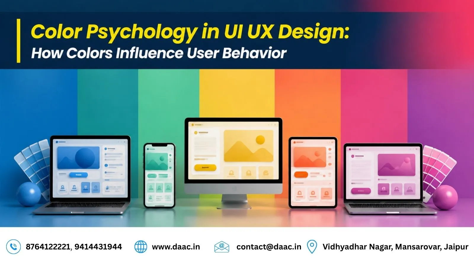
Color is one of the most powerful elements in digital design. Before users read a headline, click a button, or explore a website, they subconsciously react to colors. This psychological response plays a significant role in how users perceive a brand, interact with an interface, and make decisions.
Modern digital products are no longer judged solely by functionality. Users expect visually appealing experiences that feel intuitive and emotionally engaging. This is where Color Psychology in UI UX Design becomes essential. Designers use color strategically to guide attention, improve usability, build trust, and increase conversions.
From mobile applications and websites to SaaS platforms and e-commerce stores, color choices directly influence user behavior. Companies like Google, Spotify, Airbnb, and Netflix carefully select color palettes that align with their brand identity and user expectations.
In this guide, we will explore how color psychology affects digital experiences, the meaning behind different colors, real-world examples, and best practices that UI/UX designers should follow in 2026.
Why Color Psychology Matters in Digital Design
Color psychology studies how colors influence human emotions, perceptions, and actions. While personal preferences and cultural differences exist, many colors trigger similar emotional responses across large audiences.
When users visit a website or app, their brain processes visual information within milliseconds. Color often becomes the first element they notice.
Effective color selection can:
- Increase user engagement
- Improve brand recognition
- Guide navigation
- Influence purchase decisions
- Enhance accessibility
- Strengthen emotional connections
Research consistently shows that users form opinions about digital products within seconds. A thoughtfully chosen color scheme can create positive first impressions and encourage deeper interaction.
The Science Behind Color and Human Behavior
Colors influence the brain through emotional and psychological associations developed over time. These associations often affect decision-making without users realizing it.
For example:
- Red can create urgency.
- Blue promotes trust.
- Green suggests growth.
- Yellow creates optimism.
This is why many successful brands carefully align their colors with their business goals.
A banking application aims to create trust and security, while a food delivery platform may use energetic colors that stimulate action and excitement.
Understanding these emotional triggers helps designers create experiences that feel natural and intuitive.
Understanding the Meaning of Different Colors
Red: Energy, Urgency, and Action
Red is one of the most attention-grabbing colors in design. It stimulates emotions and encourages immediate action.
Common uses include:
- Sale promotions
- Limited-time offers
- Error notifications
- CTA buttons
Real Example:
Netflix uses red prominently throughout its interface. The color creates excitement and instantly draws attention to important actions and content recommendations.
However, excessive use of red can feel overwhelming, so designers typically use it strategically.
Blue: Trust, Stability, and Professionalism
Blue remains one of the most popular colors in digital products because it creates feelings of trust and reliability.
Industries commonly using blue include:
- Banking
- Technology
- Healthcare
- Corporate services
Real Example:
Facebook, LinkedIn, and PayPal rely heavily on blue because users associate it with security and professionalism.
For SaaS platforms and business applications, blue often improves user confidence and perceived credibility.
Green: Growth, Success, and Positivity
Green is strongly associated with nature, health, balance, and financial growth.
It is frequently used in:
- Finance applications
- Health platforms
- Sustainability-focused brands
- Productivity tools
Real Example:
Spotify uses green as its primary brand color. The vibrant green helps differentiate the platform while creating a fresh and energetic visual identity.
Green is also commonly used for success messages because users naturally associate it with positive outcomes.
Yellow: Optimism and Attention
Yellow creates feelings of happiness, energy, and positivity. It quickly attracts attention but should be used carefully.
Common applications include:
- Promotional highlights
- Feature announcements
- Product launches
- User onboarding screens
Because yellow can become visually overwhelming, designers often combine it with neutral colors for balance.
Orange: Creativity and Enthusiasm
Orange combines the energy of red with the friendliness of yellow. It often encourages engagement and action.
Brands use orange for:
- Call-to-action buttons
- Startup websites
- Educational platforms
- Creative applications
Its energetic appearance makes it highly effective for increasing interaction rates.
Purple: Innovation and Luxury
Purple is commonly associated with creativity, innovation, and premium experiences.
Industries using purple include:
- Beauty brands
- Luxury products
- Creative software
- AI-powered solutions
As technology evolves, many innovative companies are using purple gradients to communicate futuristic experiences.
Black: Sophistication and Authority
Black conveys elegance, exclusivity, and power.
Luxury brands frequently use black because it creates a premium visual appearance.
Examples include:
- Fashion brands
- Luxury automobiles
- Premium technology products
When paired with white space, black can create a modern and highly professional interface.
White: Simplicity and Clarity
White provides breathing space and improves readability.
Benefits include:
- Cleaner layouts
- Better focus
- Improved usability
- Minimalist aesthetics
Most modern UI systems use white or light backgrounds because they enhance content visibility and reduce cognitive overload.
How Color Influences User Experience
Creating Strong First Impressions
Users often decide whether to stay on a website within a few seconds. Color plays a major role in shaping these initial impressions.
A professional color scheme immediately communicates quality, trustworthiness, and brand personality.
Poor color choices can make even well-designed websites feel outdated or confusing.
Guiding User Attention
One of the most practical uses of color is directing user focus.
Designers use contrasting colors to highlight:
- Buttons
- Important messages
- Navigation elements
- Forms
- Promotional sections
For example, a bright CTA button on a neutral background naturally attracts attention and improves click-through rates.
Strengthening Brand Recognition
Consistent colors help users recognize and remember brands.
Studies show that color can significantly improve brand recall because visual memory is often stronger than textual memory.
Successful brands maintain color consistency across:
- Websites
- Mobile applications
- Social media
- Advertising campaigns
This consistency creates familiarity and trust over time.
Accessibility and Inclusive Design
Color selection should never focus solely on aesthetics.
Millions of users experience visual impairments or color vision deficiencies. Designers must ensure that interfaces remain accessible for everyone.
Important accessibility practices include:
- High contrast text
- Readable font colors
- Alternative visual indicators
- Accessible button states
- Color-blind-friendly palettes
Accessibility is not only a usability requirement but also a crucial ranking factor for user satisfaction and retention.
Modern Color Trends in UI UX Design for 2026
The design industry continues evolving, and several color trends are shaping modern interfaces.
Popular trends include:
- AI-inspired gradients
- Soft pastel palettes
- Dark mode interfaces
- Glassmorphism color schemes
- Minimalist neutral backgrounds
- Vibrant accent colors
Students interested in mastering modern interface design often explore the UI UX Design Course in Jaipur to understand how color systems, user psychology, and design principles work together in real-world projects.
These trends improve aesthetics while supporting usability and user engagement.
Best Practices for Using Color Psychology in UI UX Design
To maximize the impact of color, designers should follow proven principles.
Research Your Audience
Different audiences respond differently to colors based on demographics, industry expectations, and cultural factors.
Maintain Consistency
Use a defined color system across all screens to create a cohesive experience.
Prioritize Readability
Strong contrast between text and backgrounds ensures content remains easy to consume.
Use Color Purposefully
Every color should support usability, communication, or emotional engagement rather than existing purely for decoration.
Test and Optimize
User testing helps identify whether color choices improve engagement and conversions.
Many aspiring designers also learn practical implementation through the Figma Course in Jaipur, where color systems and design components are applied to real UI projects.
Conclusion
Color is much more than a visual element. It influences emotions, shapes perceptions, guides behavior, and impacts business results. Understanding Color Psychology in UI UX Design allows designers to create interfaces that are not only visually appealing but also highly effective from a usability perspective.
Whether building an e-commerce platform, mobile application, SaaS product, or corporate website, strategic color choices can improve user engagement, strengthen brand identity, and increase conversions. As digital experiences become more competitive in 2026, designers who understand color psychology will continue creating products that connect with users on a deeper level.
FAQs
1. What is color psychology in UI UX design?
Color psychology in UI UX design refers to the study of how colors influence user emotions, perceptions, and behavior while interacting with digital products.
2. Which color is best for increasing trust in a website?
Blue is commonly associated with trust, security, and professionalism, making it a popular choice for corporate and financial websites.
3. Why do designers use red for call-to-action buttons?
Red attracts attention and creates a sense of urgency, encouraging users to take immediate action.
4. How does color impact user experience?
Colors influence navigation, emotional response, readability, engagement, and overall perception of a digital product.
5. Is accessibility important when selecting colors?
Yes. Accessible color combinations improve readability and ensure users with visual impairments can effectively use the interface.