
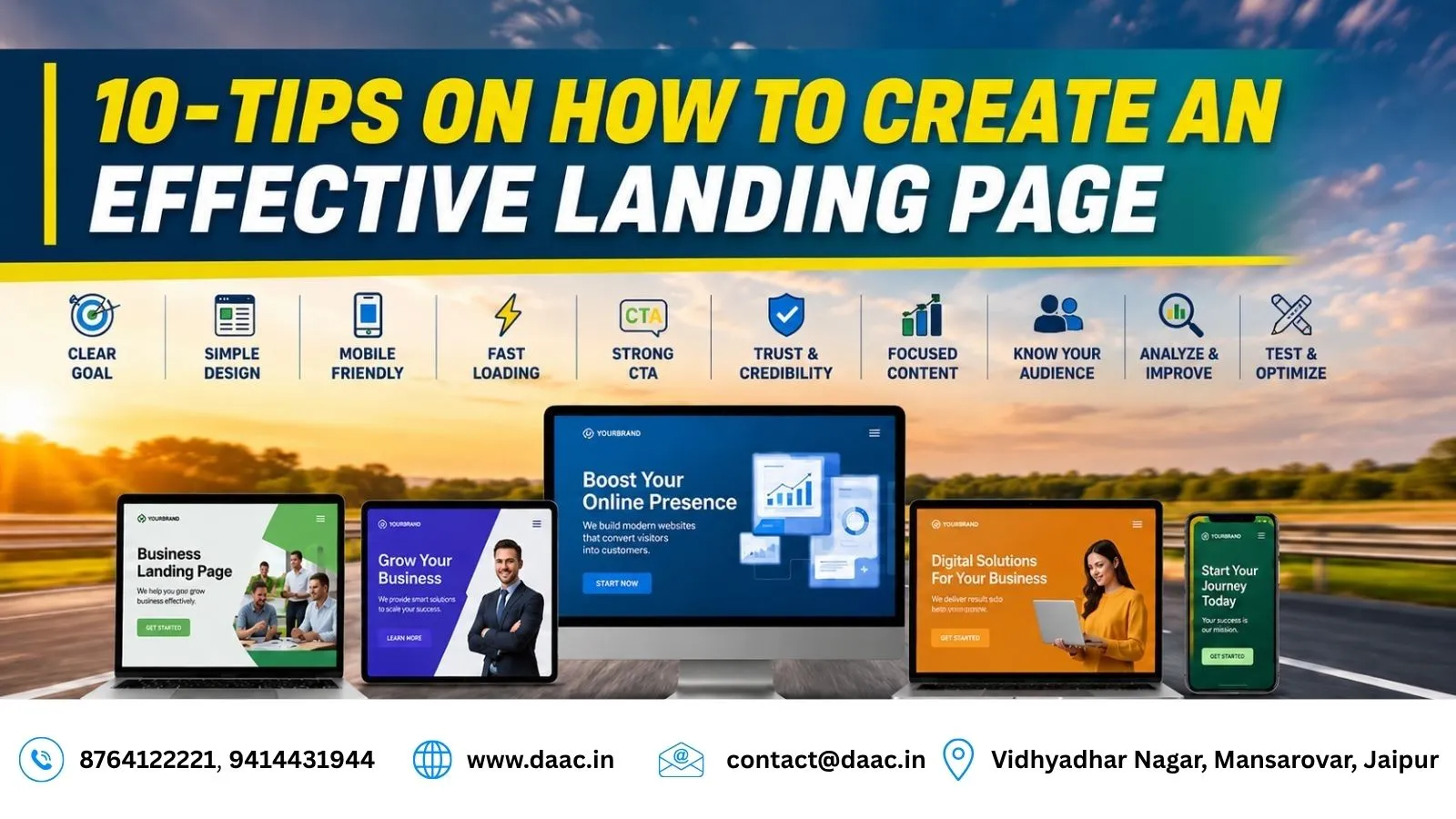
1. Keep Your Landing Page Design Clean and Organized
The first impression of your landing page significantly influences visitor behaviour. A cluttered layout can confuse users and distract them from the primary objective. Instead, focus on a clean structure that guides visitors naturally toward your call-to-action (CTA). Use white space effectively, maintain consistent branding, and ensure important elements remain visible without overwhelming the audience.
Modern businesses prioritize simple layouts that make it easy for visitors to understand an offer and decide what to do next. Effective Landing Page Design uses a clear visual hierarchy, relevant images, readable typography, and strategically positioned buttons to create a smooth user journey.
Focus on a Clear Visual Hierarchy
Organize the page so visitors can quickly identify the headline, key benefits, supporting information, and primary CTA. Use headings and short paragraphs to separate ideas, and avoid unnecessary animations or decorative elements that compete for attention.
Keep the Main Action Visible
Place the primary CTA where visitors can easily find it, especially near the top of the page. For longer landing pages, consider adding another CTA after important sections so users can take action when they feel ready.
2. Follow a Minimalist Content Approach
Many businesses make the mistake of adding too much information to their landing pages. While details are important, excessive content can reduce clarity and overwhelm visitors. A minimalist approach allows users to focus on the most valuable information without distractions.
Every section should serve a purpose and contribute toward the conversion goal. Explain what you offer, who it is for, what benefits it provides, and what visitors should do next.
Make Content Easy to Scan
Use concise paragraphs, bullet points, descriptive headings, and short explanations to improve readability. Visitors often scan a page before deciding which sections deserve closer attention.
Highlight important benefits rather than filling the page with lengthy descriptions. If you have several features to explain, organize them into short, clearly labelled sections.
Remove Unnecessary Information
An effective landing page focuses on quality rather than quantity. Remove repetitive messages, irrelevant links, unrelated offers, and sections that do not support the primary goal.
For example, a landing page promoting a training program should prioritize course benefits, curriculum highlights, learning opportunities, and the inquiry form instead of distracting visitors with unrelated promotions.
3. Create Headlines That Highlight Value
Your headline is often the first thing visitors notice after arriving on your page. A strong headline immediately communicates the value of your offer and encourages users to continue reading.
Instead of focusing on features alone, explain how your product, service, or course solves a problem or delivers a benefit. A headline such as “Learn Job-Oriented Skills with Industry Experts” is more informative than a generic statement such as “Welcome to Our Institute.”
Write a Clear and Benefit-Focused Headline
Your headline should tell visitors what they can expect. Use simple language that matches their needs and avoids exaggerated promises.
For example, a business offering professional training can highlight practical learning, skill development, or career preparation, provided those benefits accurately reflect the program.
Support the Headline With Compelling Copy
Add a short subheading that explains the offer in more detail. Follow it with two or three important benefits and a clear CTA.
This approach helps visitors understand the offer quickly and supports Conversion Rate Optimization by reducing uncertainty and guiding users toward the next step.
4. Build Trust Through Social Proof
Trust plays a major role in online decision-making. Visitors are more likely to complete a form or make a purchase when they feel confident about your credibility. Adding authentic testimonials, reviews, ratings, certifications, and customer success stories can reduce hesitation among potential customers.
For educational institutes and service businesses, genuine feedback can help visitors understand what the experience is like before making an inquiry.
Display Authentic Reviews and Testimonials
Use real customer feedback that is relevant to the offer. Where permission is available, include the person’s name, role, or other appropriate context to make the testimonial more meaningful.
Avoid fabricated reviews, misleading ratings, or claims that cannot be verified. Trust signals work best when visitors can assess them confidently.
Support Claims With Evidence
If you mention certifications, student achievements, client results, or placement outcomes, make sure the information is accurate and current.
You can also explain your process, introduce your team, or provide examples of completed work. These details help visitors evaluate your credibility and make informed decisions.
5. Make Your Landing Page Mobile Friendly
Mobile optimization is essential because many visitors access landing pages through smartphones. A page that looks attractive on a desktop may become difficult to use on a smaller screen if its text is too small, buttons are difficult to tap, or forms require excessive scrolling.
A responsive layout adjusts to different screen sizes and helps users navigate the page comfortably.
Optimize Layout and Mobile Navigation
Use readable font sizes, appropriately sized buttons, and enough space between clickable elements. Keep the most important information easy to find and make sure forms work smoothly on touchscreens.
Check the page on different screen sizes rather than assuming that a desktop preview represents the complete user experience.
Improve Loading Speed and Accessibility
Compress images, reduce unnecessary scripts, and avoid heavy visual elements that slow down the page. Test loading performance using suitable website performance tools.
Also provide descriptive image text where appropriate, maintain sufficient colour contrast, and use clear form labels. These improvements make the page easier to use for a wider range of visitors.
6. Keep Forms Short and User-Friendly
Forms are a critical part of many landing pages, especially when the goal is Lead Generation. However, asking for too much information can discourage users from completing the process. Focus only on the fields required to begin a useful conversation with the prospect.
For example, collecting a name and one appropriate contact method may be enough for an initial inquiry. Additional information can be requested later when necessary.
Educational institutes promoting a Web Development Course in Jaipur can use a simple inquiry form to make it easier for interested learners to request course details.
Ask Only for Essential Information
Review every form field and ask whether it is genuinely necessary at this stage. Remove questions that do not help you qualify, contact, or assist the visitor.
Use clear labels and helpful instructions so users understand what information is required. If a field is mandatory, indicate that clearly.
Make Form Submission Easy
Use a descriptive button label such as “Request Course Details” or “Get a Consultation” instead of a vague label such as “Submit.”
Provide a clear confirmation after successful submission and explain what happens next. Make sure the form works properly on mobile devices and that inquiries reach the correct team.
7. Personalize Landing Pages for Different Audiences
Different audiences have different needs, expectations, and motivations. Creating relevant landing pages helps improve the visitor experience and makes your offer easier to understand.
Visitors arriving from social media campaigns may need different messaging from those searching for a specific service or arriving through an email campaign.
Understand Your Audience and Their Intent
Before creating a landing page, identify your target audience, their main problem, and the action you want them to take.
For example, a page for beginners may emphasize foundational knowledge and guided learning, while a page for experienced professionals may focus on advanced skills and practical applications.
Adapt Content to the Campaign
Align your headline, benefits, visuals, and CTA with the audience and campaign source. If you run separate campaigns for different services, consider creating dedicated landing pages rather than sending every visitor to the same generic page.
Personalization should remain relevant and respectful of user privacy. Avoid using unnecessary personal information or making assumptions that could create an uncomfortable experience.
8. Match Landing Page Content With Advertisements
Consistency between advertisements and landing pages is essential for maintaining user trust. When visitors click an ad, they expect to find information directly related to the message they saw. A mismatch between the advertisement and the landing page can create confusion and increase the likelihood that users leave without taking action.
For example, if an advertisement promotes a free marketing workshop, the landing page should prominently feature that same offer and explain how to register.
Maintain Consistent Messaging
Use the same core offer, benefits, terminology, and expectations across your advertisements and landing pages. Visitors should immediately recognize that they have arrived at the correct destination.
Make sure the page clearly explains important details, including eligibility requirements, pricing where relevant, dates, and any conditions attached to the offer.
Align Your CTA With the Campaign Goal
Choose a CTA that matches the action promised in the advertisement. If the campaign promotes a downloadable guide, the page should make the download process clear. If it promotes an inquiry, the form should support that purpose.
This consistency strengthens your Digital Marketing Strategy by connecting campaign messaging with the visitor’s next step.
9. Continuously Test and Improve Performance
Successful landing pages are rarely perfected on the first attempt. Continuous testing helps identify opportunities for improvement and optimization. Businesses should regularly review headlines, images, form layouts, button text, and calls-to-action to determine what resonates with their audiences.
Rather than relying entirely on assumptions, use performance data to understand how visitors interact with the page.
Conduct A/B Testing
A/B testing compares two versions of a page or element to identify which performs better against a defined goal. You might test two headlines, alternative CTA wording, or different form layouts.
Whenever possible, change one major element at a time so that you can better understand what influenced the result. Ensure that each version receives enough relevant traffic before drawing conclusions.
Track Meaningful Performance Metrics
Monitor metrics that relate directly to the page’s objective, such as:
- Conversion rate
- Form completion rate
- CTA click-through rate
- Cost per lead
- Traffic source performance
- Form abandonment rate
Use these insights to identify areas for improvement. Effective Conversion Rate Optimization is an ongoing process that combines user feedback, measurement, and careful experimentation.
10. Use Urgency and Scarcity Strategically
Urgency and scarcity can encourage visitors to take action when an offer has a genuine deadline or limited availability. Examples include limited-time discounts, scheduled enrollment periods, and events with a fixed number of seats.
However, these tactics should always be transparent. False countdown timers or claims of limited availability can damage credibility and discourage future customers.
Communicate Genuine Deadlines
If registration closes on a particular date or an event starts soon, display the relevant information clearly. Explain any conditions that affect availability so visitors can make an informed decision.
For example, a training institute can communicate its actual enrollment deadline or the confirmed start date of an upcoming batch.
Encourage Action Without Misleading Visitors
Use clear CTA text that explains what happens next, such as “Register for the Upcoming Batch” or “Request Enrollment Details.”
Avoid creating artificial pressure. The goal is to help interested visitors make a timely decision, not to make them feel forced into a purchase.
Additional Elements That Improve Landing Page Performance
Beyond the ten core tips, several supporting elements can further improve the effectiveness of a landing page. These should complement the primary conversion goal rather than distract visitors from it.
Essential Landing Page Elements
- Fast loading speed
- High-quality, relevant visuals
- Strong call-to-action buttons
- Clear, benefit-focused copy
- Simple navigation
- Consistent branding
- Secure website connection
- Accessible forms and content
- Clear privacy information where personal data is collected
Review the Complete User Journey
Consider what happens before and after a visitor reaches your landing page. The advertisement, search result, landing page, form submission, and follow-up communication should create a consistent experience.
Check that buttons work, forms submit successfully, confirmation messages appear, and inquiries reach the right destination. Small technical issues can interrupt the journey even when the page design and content are strong.
Conclusion
Creating an effective landing page requires more than attractive visuals. It involves understanding user behaviour, delivering clear value, building trust, and optimizing every element for conversions. From clean layouts and mobile responsiveness to personalized messaging and continuous testing, each component plays an important role in performance.
Key Takeaways
Focus on one clear goal, communicate benefits in simple language, reduce unnecessary form fields, and ensure the page matches the campaign that brings visitors to it. Use authentic trust signals and measure meaningful results so you can improve the experience over time.
How DAAC Supports Digital Skills Development
DAAC provides career-focused training in Jaipur, including web development and other technology-related programs. By developing practical knowledge of website design, user experience, and digital marketing fundamentals, learners can better understand how websites support business objectives and online campaigns.